


Date
2023 - 2024
Role
UX, UI, Visual Design, Interaction Design
At Cronofy, my responsibilities included leading the design initiatives for the Scheduling Platforms and covering areas such as branding, marketing websites, and enhancing product usability all around. Below, you will find some of the main challenges I encountered, the processes I followed, the learning, and the outcomes of my key projects during this time.
cronofy.com
Cronofy underwent a significant rebranding and repositioning effort before I joined, but before that there was no permanent design function in the company and the product hadn’t been built with proper design in place. As a result, the new branding and design ended up feeling disorganised.
Inconsistent design
The app and branding felt disconnected, with no clear or cohesive direction.- Bugs and errors
The lack of structure created numerous inconsistencies and implementation problems. - Inefficient workflows
Both design and development workflows were hampered by the disorganised and chaotic setup.
To address these challenges, I took the initiative to consolidate everything into a unified design system. Creating components and increasing their reuse rate. Improving the consistency across platforms and reducing design and development time for new features.
Previously, there had been multiple, loosely referenced “design systems” that didn’t work well together. I merged these into a single source of truth that was both simple and intuitive to use. The design system I created followed an atomic design methodology and was structured into three main sections:
Common parts: The essential elements of the brand and product, including the logo, colour palette, typography, icons, buttons, and breakpoints.
App: All the product specific part and components.
Web: All the marketing website which was the most developed part of the previous assets.
I also introduced a tokenised colour system using Figma variables. This helped to reduce the size of the library significantly by avoiding pointless duplicates and made it easier to adopt and maintain. By tokenising colours and creating a clear hierarchy, the design system became more efficient and future-proof.
Tokenised design system and variables example
This new structure brought clarity and order to the design process, significantly improving workflows for both the design and development teams.I also introduced a tokenised colour system using Figma variables. This helped to reduce the size of the library significantly by avoiding pointless duplicates and made it easier to adopt and maintain. By tokenising colours and creating a clear hierarchy, the design system became more efficient and future-proof.
This new structure brought clarity and order to the design process, significantly improving workflows for both the design and development teams.
Mode

When I joined the company, one of my first big tasks came from my own experience during onboarding. When I was navigating the request creation flow – the main activity of the product – I felt lost and frustrated. Even though I wanted to understand it, the process was not smooth. The form was long with many settings, and it was difficult to complete, especially in a small browser extension. Since the extension is the main way users can access the smart autofill features on some of the ATSs, I understood this problem needed to be fixed immediately.
Limited Browser Extension Size
The extension appeared as a small 1:1 square, located under the browser icon. This was in stark contrast to many competitors, who offered full-height side panels that provided more space for the user.
Another usability issue was the extension’s behaviour: if users clicked outside the extension, it would immediately close, causing them to lose any progress. This was frustrating, especially when trying to copy and paste information from outside the form. Not letting them do that prompts them to make errors with typing in details.
During user interviews and Hotjar screen recordings, it became clear that this behaviour was a major pain point. Many users reported losing their work accidentally by clicking outside the extension, which led to drop-offs, frustration, and doomscrolling back and forth because they got confused and got lost- Lack of Visual Guidance
The form didn’t provide clear inline error messages or visual clues for required fields. While we technically only had one required field (the Invitee field), users often overlooked it because it appeared early in the process, and the sticky footer showed the "Create New Request" CTA in an inactive state until that field was filled.
The form’s length and complexity made it particularly overwhelming for first-time users, who often struggled to know what to focus on next. Lack of structure created numerous inconsistencies and implementation problems. - Inefficient workflows
The average request creation time was more than 5 minutes, far longer than the intended goal of a quick, seamless process. This was especially problematic for users unfamiliar with the product, who often spent unnecessary time navigating between different settings and options.
I went through several rounds of ideation and testing to make sure we addressed the most critical user pain points. I started by mapping out different ways to split the request creation flow and experimented with varying layouts for the extension. I created low-fidelity wireframes to gather initial feedback, then moved on to high-fidelity prototypes in Figma for more detailed testing.
I conducted mostly unmodarated testings and some remote sessions with both existing and first time users to observe how they interacted with the prototype. The main goals were to check if users understood the steps of the form clearly and if the interface provided enough context and guidance to help them complete their tasks without confusion.
Step-by-Step / Guided Mode
I changed the form to follow a step-by-step flow, similar to onboarding or checkout. I divided it into three clear steps (four, if you include the launcher).Each step had clear validation and confirmation to help users move forward with confidence.This way, users were less overwhelmed, and it was easier for them to focus on one task at a time.

Figma Prototype

Fixed Side Panel
To fix the issue of the small extension size, I created a fixed side panel that used the full height of the browser window. This gave users more space to see the form and all its elements. Inline error messages were now visible immediately when mistakes happened, so users could correct them right away.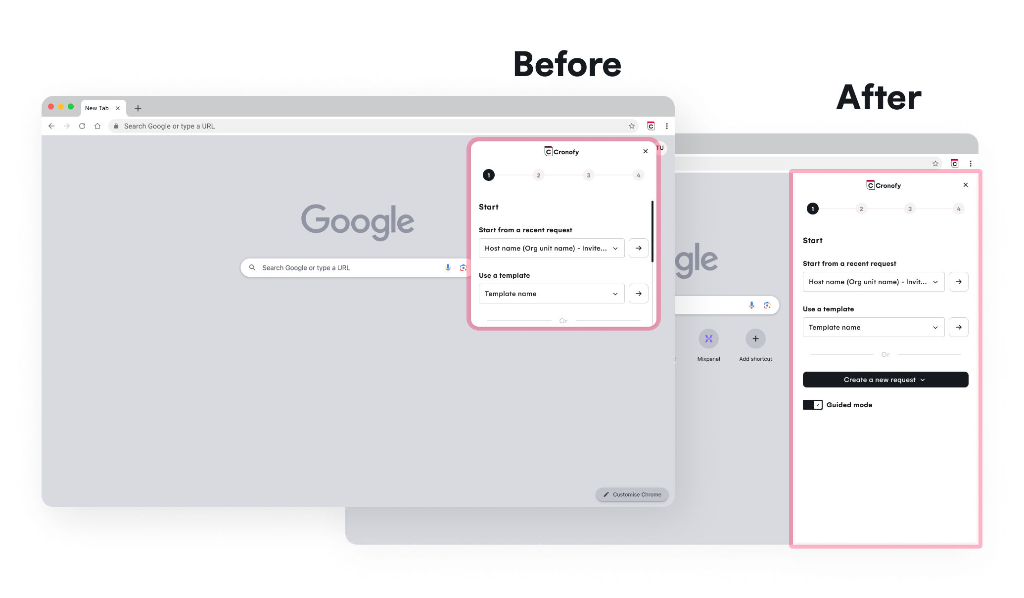
Cleaner, Simpler Structure
The overall design of the form was simplified to make it less intimidating, especially for new users. Instead of a complicated process, the new flow was clear and linear, helping users trust the product more.This not only made the experience better for users but also encouraged them to keep using the tool in the future.
By fixing these problems and redesigning the request creation process, we turned a frustrating experience into a smoother and faster one.
completion time

Bad UX isn’t created overnight. It happens when small, disconnected changes pile up over time until one day when users struggle even with the most simple and obvious tasks. That’s exactly what happened with Cronofy’s navigation. Over multiple iterations—whether during rebranding or incremental improvements before my time—the navigation slowly lost its structure. Partial redesigns fixed short-term needs, but they didn’t consider the full user journey.
To fully understand the problem, I conducted usability testing, analysed heatmaps and screen records from Hotjar, reviewed support tickets, and after countless customer success team talks, here are the findings:
All these frictions add up to support costs and lower activation rates. For different personas, we have different activation goals. Admins need to complete the initial setup, and members will create a request.
Before introducing, and hiding there any new shiny feature, I reworked the entire navigation and Organisation Unit structure with a clear, user-first approach.
Fixing Information Architecture
• Grouped related actions into intuitive categories for easier navigation.
• Reduced menu items by removing duplicates and redundancies, streamlining the experience.
• Prioritized key actions, making them more accessible and quicker to find.
Improving discoverability• Simplified labels to match what users expect.
• Navigation with section headers for clarity and a clear hierarchy of the actions to take.
• Consistent search and filteringGeneral UX improvements
• Reduced clicks needed to complete key actions.
• Improved navigation flow for new users.
Navigation should be invisible and feel effortless. If the user gets lost or just even have to think too hard, then it's broken. If the user can't find it it doesn't exist. Discoverability is the first step to functionality.
Multi-Event Scheduling
Templates


Contacts
Give me a call,
drop me a line or just use the form
