Date
2021 - 2022
Role
Lead product designer, UX, UI, Art direction, Visual Design
Happence is a workplace mental health and wellbeing platform that focuses on the science of a happy workforce. It is designed to support leaders and their teams in companies such as Lloyds, Bupa, Inditex, and many more.
happence.com
When I joined Happence, formerly known as Helix Resilience, I discovered that they had undergone a comprehensive rebranding process to align their brand with the new features of their mobile product. Previously, their content and digital therapy services were only available on desktop, and even their web portal lacked responsive mobile capabilities. This posed a challenge for certain clients, particularly banks, as access to the platform was restricted to company IP addresses and firewalls, preventing users from accessing Happence content and pathways outside of their workplace. This is precisely the issue that the mobile app aims to resolve.
Upon joining the team, I discovered that the Mobile MVP had been in development for over 9 months, yet it was still grappling with significant usability bugs and serious accessibility concerns. It became evident that the root cause of these issues stemmed from the absence of a design system and a lack of any processes during the design phase.
As I began tackling the task of fixing the designs and testing for issues, I discovered more and more problems with our developer partner. Eventually, we made the tough decision to replace them. It was a lengthy process, and it became evident that starting from scratch was the best course of action. While this provided us with a clean slate, it also meant we had to work under a tight deadline.

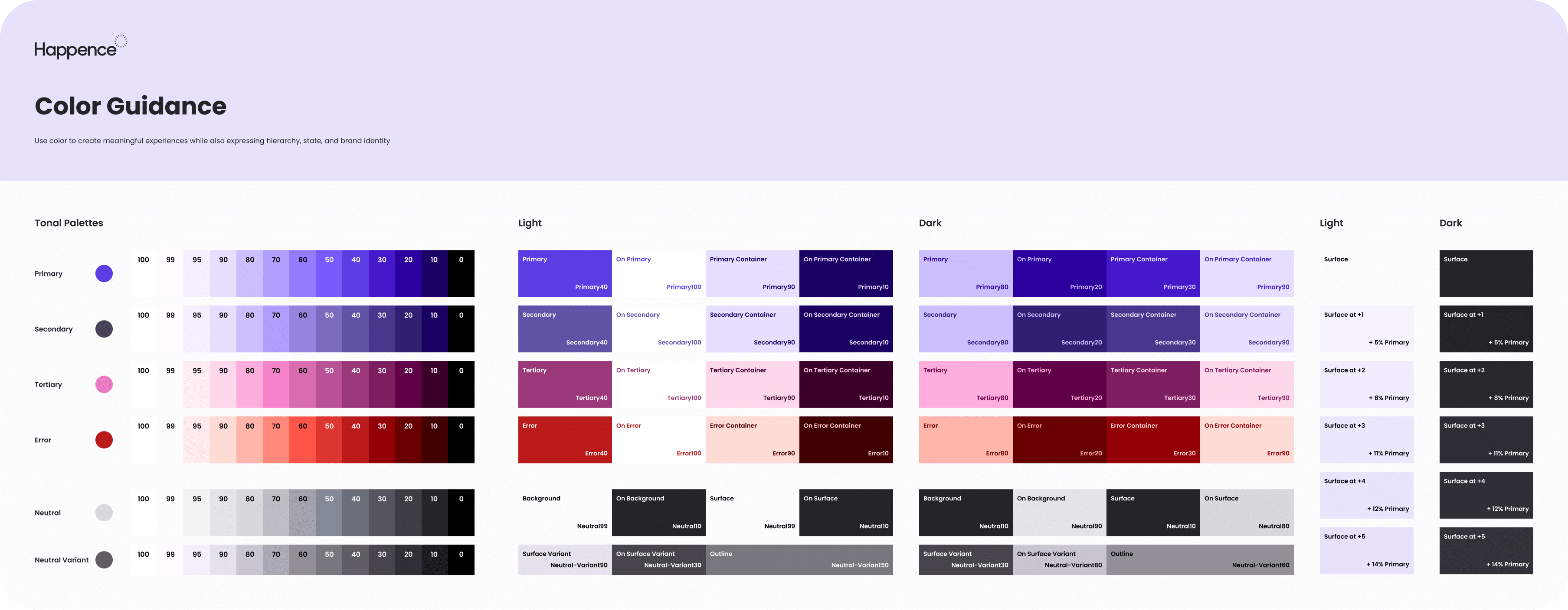
Despite the demanding deadline, I made every effort to validate each aspect of the designs, conducting thorough tests and implementing them alongside a comprehensive design system. Leveraging the Material 3 UI kit as a foundation provided us with a valuable head start, and introducing the concept of a tokenized system proved to be a game-changer for the entire team. Having previous experience with design tokens, I am particularly enthusiastic and grateful for any solution that bridges the divide between design and development.


As we dove into app development, we also kicked off the creation of a custom CMS. We wanted to ensure a consistent and polished vibe, so we opted for the Material 2 UI kit, which gave both the CMS and the mobile app a cohesive look and feel.
It's all about keeping things on-brand and functioning flawlessly. We knew we were building the foundation for a platform that's primed for rapid expansion in the not too distant future.


Even from the early stages with the MVP, our app had one key mission: to measure and track the user's well-being. It's all about helping users stay on top of their health and providing them with relevant content. And in some cases, when they need it most, we even connect them with experts who can offer personalized advice and recommendations.

Despite the challenging time constraints leading up to the launch, we triumphed in establishing the essential foundations of our product. Our primary focus was to provide our users with a clear purpose while setting a path for ongoing enhancements. Additionally, we made sure that our content was easily discoverable and engaging.


