


Date
2020 - 2021
Role
Product and Interaction Designer, UX, UI, Art direction, Visual Design
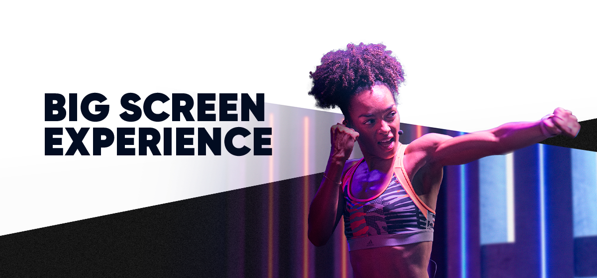
The Fiit Interactive TV App seamlessly brings the world of fitness and wellness to your living room, reimagined for TV screens. It represents the best of Fiit's interactive fitness experiences, carefully tailored for TV while maintaining brand integrity and familiarity with the mobile app. The challenge was to adapt the app for TV, ensuring an improved user experience for all while preserving the essence that Fiit users love.
fiit.tv
Available on

6


Onboarding main steps
The TV app is conveniently preinstalled on popular devices like Sky Q boxes, Amazon Fire TV sticks, and Samsung smart TVs.
Once you launch the app, you're immediately immersed in an electrifying experience, starting with an invigorating buzz video that sets the tone. Of course, for those who prefer a more subdued approach, the video can be skipped—it's all about catering to individual preferences.
We wanted the signup process to be as effortless as possible. That's why we designed it to be seamless, requiring only an initial email verification to kickstart your free trial experience. Through a simple pairing code flow, you can swiftly begin your fitness journey without any unnecessary obstacles.


Hero card variants
Upon launching the app, you will find yourself on our primary screen, known as the "Browse" page. On the left side of the screen, you'll notice the main navigation bar, while the rest of the area is dedicated to content display. The top centrepiece of the screen is the Hero carousel, a dynamic showcase that highlights different aspects and features of our product. These slides effectively present our training plans, an intuitive class finder flow, our Trainers page, and our latest and greatest content. The remaining sections of the page maintain a consistent structure, mirroring the layout of our mobile app.
One of the main challenges of a TV UI is navigating and browsing with a tv remote.
To capture the user's attention and ensure convenience, the current state of every element must be easily discernible.

Browse page
Card transition
5

Class details main parts
When designing the class details, the main principle was to maintain parity with the mobile apps as before, while also utilizing the advantages of the TV platform's larger screens.
This includes providing a more brandy and immersive representation of the classes, with an almost full-height class image on the right that still allows for showcasing all the main action and information on the page.
Breaking up the pages into tabs helps to keep the structure simple and maintain visibility of sections that are not initially visible.
To track their performance and progress, users must connect a Fiit tracker or any other compatible fitness tracker, such as an Apple Watch or an Android smartwatch, right before each class they take.
This is the only part of the TV experience where the users (and the TV app) still need their mobile since the trackers require Bluetooth access.
5

Connecting tracker main steps

Detailed steps


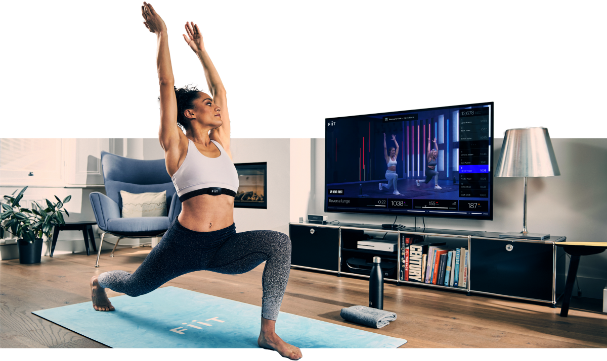
With the fitness tracker, a live leaderboard class with friends or just some competitive strangers, a Fiit workout is a unique experience. And the TV UX makes the experience even more engaging with live updates of the leaderboard and your metrics and in class animations highlighting and making the best moments even better.
These are only the main highlights of the project. For more, please take a look around in the Figma file.


Contacts
Give me a call,
drop me a line or just use the form
